Portland WNBA Team Name & Logo Concept

Duration
December 2024 - March 2025
(on and off for 3 months)
My Role
Graphic Designer, Researcher
Tools
Affinity Illustrator, Affinity Photo
Why
Passion Project
Project Overview
More expansion teams continue to be added to the WNBA, one of the latest being Portland, Oregon. This team will be another major sports team added to Portland's already bustling sports culture.
A team name hasn't been released yet as it will be active in 2026. My goal was to come up with a name and logo that is cohesive with Portland's sports teams and culture whilst standing out amongst the current WNBA franchises.
Brainstorming & Sketching


Like my Toronto WNBA project, I started out researching various aspects of Portland's history, culture, and sports. When brainstorming, I made a diagram that categorized possible team names and tried to incorporate things that were unique to Portland. Initially, I had trouble narrowing down my options, and eventually made a pros and cons list with my 10 favorites. I then had some friends and family vote on their favorites and narrowed down further to Portland Trolls or Portland Albatross ("Tross" for short).
Some considerations and criteria that led to these two options include: starting with a "T", uniqueness, and reflects Portland culture or nature. I wanted a name that started with a "T" because the major Portland sports teams all start with that letter (Trailblazers, Thorns, Timbers) and I wanted this WNBA team to be cohesive with them. I wanted a unique name that kept up with the "Keep Portland Weird" sentiment. Lastly, I believe every team name should connect to the culture and people in the city it represents.

Initial Logo Renders

I began rendering some logo options for both Trolls and Albatross because I still couldn't decide on a final team name. I explored some options for both names like including the St. Johns Bridge in the "T" of Trolls and including an Albatross silhouette as the "T" in Albatross.
As I continued designing, I wasn't convinced that these name options and logos were working. I decided to go back to the drawing board to find a better selection of team names.

Back to the Drawing Board
Initially I wanted to go all in on Portland Ivy because I thought it sounded very strong and bold. I also attributed the name to Poison Ivy, the supervillan/antiheroine from Batman. I was thinking that the concept would be very cool and unique to the league and would provide for a lot of branding opportunities, rivalries, and excitement. I ended up passing on this idea when I saw that ivy isn't native to Portland and could actually be seen as negative due to it being an invasive species.
This then led me to Portland Trekkers. It checked off a lot of boxes - starts with a "T", sounds unique, and relates to nature and Portland culture. However, I had a hard time envisioning what the logo and branding could look like. Still, I trusted the process and moved on to sketching and rendering some options.


Going back to the drawing board I wanted to focus on nature, plant life, and outdoors of Portland. I found that this aspect of the city is something that makes it stand out from the other cities represented in the W. This led me to the name options ivy and trekkers.
Logo Renders Part 2


I started the Trekkers logo off by creating a custom font. I decided to go for a modern sans serif option that also conveyed movement.
From here the inspiration for my first round of Trekker logos was a hiking boot. I wanted to bring in the popular hiking culture of Portland as well as the definition of a trekker being a traveler taking a long arduous journey.


I didn't really like the shoe look as I thought it'd be too hard to understand/read. I then pivoted and went the route of a compass rose. This is when everything started clicking in my design process.
Below are the first editions of my compass rose Trekkers logos.

Color Scheme

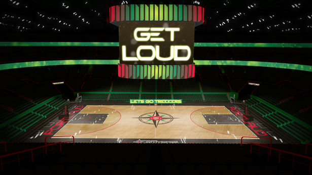
The color scheme I chose draws from similar colors to the other Portland sports teams. I mimicked the use of greens and reds but added in a rich brown.
I decided on adding brown to tie in the nature, woods, and earthiness of the city. In addition, it can be seen to reflect other elements of Portland like its rich coffee and beer culture. Brown isn't a very common color in the WNBA so I think it will add a unique touch to a unique team.
Icon Logo Meaning
Trekkers "T"
The directional points of the compass rose form a "T" to represent the first letter in the Trekkers name. This "T" team name connects this WNBA franchise with the other major Portland sports teams (Trailblazers, Timbers, and Thorns who will be sharing a facility with the Portland WNBA team)
Compass Rose
The compass rose represents direction and finding your way. This idea relates to this team because both are trying to find and make their way as dominant forces in a growing league. The name of a compass -rose- also draws back to the iconic rose garden of Portland and its nickname of rose city
Circular Elements
The middle of the compass rose forms a basketball. The outer circle of the compass rose has small lines to represent the ridges of a coin, which is a callback to the coin flip used to determine the name of the city.
Final Logos


