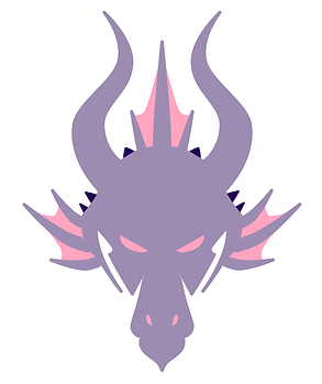
Toronto WNBA Team Name & Logo Concept

Duration
May 2024 - October 2024
(on and off for 6 months)
My Role
Graphic Designer, Researcher
Tools
Affinity Illustrator, Affinity Photo
Why
Passion Project
Project Overview
More expansion teams are being added to the WNBA, one of the latest being Toronto. This team will be a sister team to the Toronto Raptors of the NBA. In addition this team comes after an inaugural Canada WNBA game that was very well attended.
A team name hasn't been released yet as it will be active in 2026. My goal was to come up with a name and logo that is cohesive with the Raptors, yet provides it's own identity amongst the other WNBA teams.
Brainstorming & Sketching
When brainstorming, I made a diagram that categorized possible team names. I tried to incorporate things that were native to Toronto or names that could be related to the Raptors NBA team. My favorite options were Dragons or Woollies/Mammoths. Though Woollies was very unique, I ended up choosing Dragons because I think it's more recognizable. I also think that Dragons is related to Raptors more which would make branding and partnerships between the teams and fanbases easier.


Initial Logo Renders

I was going back and forth between a dragon head and a full body dragon as the main symbol logo for this team. I played around with adding a shield to border the dragon and adding other Toronto elements like the CN Tower.
I ended up going with the dragon head to push the idea of a bold and recognizable logo that can look good on several platforms and merchandise. I also decided against the shield because it felt more like a soccer logo with that border.
Branding Details
Color Palette


When looking for this team's color palette, I ended getting my inspirations from Twitter. My only criteria was that I wanted some kind of pink to be included because pink isn't a prominent color on any current WNBA team. I was also looking for a good black alternative to pair with the pink. Both palettes on the left were my choices but they felt a little dull and there were too many secondary colors.


Since I had several pinks and darks as my options, I wanted to make a matrix showcasing the possible combinations that I could have. Based on this matrix, I ended up selecting the middle dragon's colors. For secondary colors, I ended up going with a simple white, grey, and "black" which is actually a dark plum. I liked this palette more than the initial ones I was using because it felt really strong, bright, and bold which I think embodies a Dragon.
TYPE
Original Aktura font

Customized Aktura font

I wanted to use an Old English/Black Letter font for the word mark logo. To make the word mark have a custom letterform I rounded most of the corners slightly, and added a "dragon tail" to the "g". In addition, I added the CN Tower to the capital T in Toronto as a small detail.
Logo Meanings
Dragon Head (Symbol Logo/Main Logo)

Maple Leaf
The main webbing on this dragon head form the shape of the maple leaf that's on the Canadian flag. This represents the importance of this team as the first Canadian team in the WNBA

The Six
Another reference to Toronto, the small horns on the dragon head represent the nickname given "The Six". This represents the Toronto area codes, 6 Boroughs, and historical significance.

Basketball
The main horns of the dragon head actually form the lines of a basketball if you place a circle around them.
Letter Mark

The "T"
This letter mark "T" is from the full word mark of the Toronto Dragons. It's an Old English/Black Letter "T"

Maple Leaf
In relation to the Dragon Head, the maple leaf on this letter mark is made from the same webbing of the Dragon Head

CN Tower
As stated in the word mark explanation, I included the Toronto landmark - the CN tower as a replacement for the Old English detailing.

The Six
In relation with the description above, I wanted to include a 6 so I customized this font to curve the tail to form a 6.
Final Logos


