Redesigning a Personal Life Coaching Website

Duration
May 2022 - June 2022 (1 month)
My Role
UX/UI Designer, Graphic Designer, Researcher
Tools
Figma, Squarepace
Why
Client Project
Company Overview
The Self That Knows is a Life Coaching independent business whose goal is to offer guidance and support to clients in order for them to navigate growth in their personal and professional lives.
Project Overview
In collaboration with my client, our goal was to create an inviting and centralize hub for new and returning clients. We wanted to do a website redesign and brand refresh to further align the mission of The Self That Knows with the visuals presented on the website.

Research
When speaking with my client (owner of The Self That Knows), we discussed the goals she had for her business and how we could help meet those goals through the redesign of her website. We also wanted to examine the pain points that users experience while trying to book a coaching session with her.

The problems in the current design were a confusing user flow, especially when booking coaching sessions, page crowding and information overload, information architecture, and accessibility specifically for those with visual impairments. Prior to the redesign of this website The Self That Knows booked coaching sessions through personal networking and emails.
Original Home Page for The Self That Knows

Original About Me Page for The Self That Knows

Original Coaching Page for The Self That Knows
We decided to focus the redesign on addressing three main issues with her current site:
1. Confusing user flow to book a coaching session
2. Website organization and navigation
3. Overall brand cohesion
Brainstorming

Based on our main issues, I decided to go through the different user flows throughout the whole The Self That Knows website.
I then did a digital whiteboard while going through the website, taking note of things that impacted user flow, accessibility, and overall organization.
The sticky notes were color coded by which page of the website they were on.
.png)
After my whiteboard session, I realized that there was information overload which contributed to the confusing user flows.
To address this, I organized the different sections of information into clear categories. By grouping information and removing the excess, I was able to create a simplified information architecture.
This simplified version will allow for easier navigation especially for new clients wishing to book a coaching session.
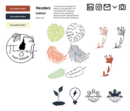
Creating a Cohesive Brand
The original color palette for The Self That Knows involved a dusty pink, white, neutral tan, and black. Based on the company goals to create a warm and inviting space for people, I recommended a new color palette and created icons and other visual elements to make a cohesive website. I wanted the aesthetic of the website to match with the themes of support and growth that are key factors for this life coaching business.

.png)
Setbacks - Limitations on Website Building Platforms
Something I didn't account for when creating my designs is the limitations of the Squarespace web building platform. Some of my layouts and design components were not transferrable to Squarespace. Therefore I had to change certain design aspects which ultimately changed the initial look I was going for.
Initial Mockups


Squarespace Changes


Conclusion & What I Learned
This was my first project where I was able to ship a finished product in the end. I was able to manage my time and redesign the whole website for The Self That Knows in 1 month. This is an improvement from when I first started UX design where it would take me about 3 months to do the same amount of work. This project gave me real world experience and taught me a lot. Here's what I learned from the experience and what I might do differently next time:
1. Be aware of the website building platform
Prior to making my wireframes and mockups, I didn't take the web building platform Would eventually use into account. I was creating designs unaware of the limitations and templates that Squarespace had. Because of this, I only realized while implementing my design that not all elements I created in my mockup would be feasible. In the future, I now know to check the constraints and layouts that specific web building platforms offer.
2. Iterate more
I only had a couple page layout ideas when redesigning this website. My client agreed with the first option so that's what we went off of. Looking back I think there may have been better options for how pages were laid out and how they displayed information.
3. Conduct usability studies
There wasn't much data to do off of when redesigning the website due to low traffic. I think that doing usability studies now that the site is updated would help in determining if the design changes that were made are actually useful for user and for the goals of the business.