Non-Profit Surf School Logo

Duration
May 23, 2022 - June 8, 2022 (2.5 weeks)
My Role
Solo Graphic Designer
Tools
Procreate, Figma
Why
Client Project
Company Overview
Hermanas del Surf is an NGO program of Mindful Waves. Their mission is to give back to the community of Nosara in Costa Rica through surf therapy for women and girls in the community by eliminating cultural, financial, and mental barriers.
Project Overview
When discussing the purpose of this new logo, my client decided she wanted me to focus on the storytelling and meaning behind Hermanas del Surf and Mindful Waves. I wanted to create a logo that encompasses the brand's mission to empower the community of women and girls in Nosara, Costa Rica through surfing while maintaining brand consistency. I was also asked to take into consideration that the logo would serve as a unique identifier on social media and merchandise (rash guards, shirts, totes, etc.). My goal was to create a logo that combines women empowerment, community, and surfing.

Sketching & Brainstorming
When brainstorming ideas for possible logos I wanted to take into account key words given to me from my client while incorporating local Costa Rican landscapes, plants, or animals. I focused on sketching designs with themes relating to femininity and support through surfing as well.
.jpeg)

.jpeg)
In digitizing my sketches, I wanted to take into account other color options, monograms, and elements that can be interpreted in multiple ways. I kept in mind the adjectives and descriptions those at Hermanas del Surf used for the non profit and different themes that were unique to Nosara, Costa Rica.
Logo Options & Meanings

This graphic looks like the letter "H" which references the "H" in hermanas. It also looks like two hands touching which relate to several important brand themes - community, connection, using your senses (touch), intuition, and trust. I also drew a lot of inspiration from popular surf brand logos (Billabong, Rip Curl, O'Neill, and Quicksilver in particular) in creating this one. Lastly, the organic shapes mimic that of waves and water which tie in the theme of the ocean and surfing.


This surfboard graphic is the most self explanatory design I made. It directly relates to this company as a non-profit surf school. Within the surfboard I made a design which subtly shows a monogram of "HDS" for Hermanas del Surf.
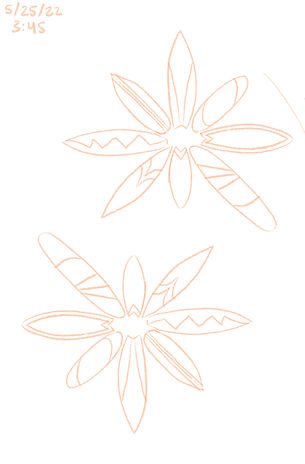
This circle of surfboards represents the community and connection gained through surfing. It also mimics the image of a flower which represents femininity and women empowerment. I chose to make these surfboards for the shape of Costa Rica's national flower - a purple orchid.

After creating three logo ideas, I began looking through different font options to pair with them. I wanted to pick legible, serif fonts that had a beachy aesthetic.
I also chose fonts that were easy to read if they were going to be put on various merchandise.
Color Palette Recommendations
In addition to the black and white logos I sent over, I sent my recommendation to change the brand's color palette slightly. They wanted me to incorporate the umbrella brand (Mindful Waves) palette but I opted to send my idea of switching out the greens with some blues. My suggestion would still use four colors from the Mindful Waves color palette. I wanted to add blues in place of greens because I believe it ties in more in with the ocean/waves, and represents trust, reliability, and quality.


Revisions & Logo Selection
My clients at Hermanas del Surf ended up loving the surfboard flower option. They decided to stick with their original Mindful Waves color palette. They wanted to see more font options that were more elegant so I sent over four options that I thought would work.

Alex Brush Font

Bilbo Swash Font

Birthstone Font

Great Vibes Font

After reviewing the elegant font choices I presented, they ultimately wanted the same font from their brand Mindful Waves. I implemented their font "modernline" and sent out the finalized logo which they ended up loving.


